At Mammoth we like to keep up-to-date with current design trends across the web. Good design is fundamental to developing a quality user experience that is engaging, purposeful, clean and direct. As the web is maturing to include innovative coding techniques using JQuery, HTML5 and CSS3, new trends are emerging to take advantage of the level of versatility available.
So, what trends are popular so far this year? Lets have a look.
10. Flat Design
Clean, minimalist design is the basis for the flat design movement. We have stepped away from over-engineered skueomorphic design with its uber-realistic gradients, shading and embossing developed to reflect reality. It is no longer important for designers to mimic realism, but now to streamline websites to present information in a cleaner, simpler way.
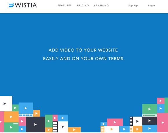
wistia.com is a great example of flat design.
Think about your phone’s calculator, web browser or its newsstand. Flat design purports that the human mind does not need the visual cues, detailed button and icon design that is usually associated with the iconography and skueomorphic design of the past.
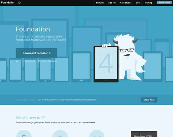
Foundation by Zurb uses a nice, monochromatic, flat design to showcase its framework.
9. Responsive Design
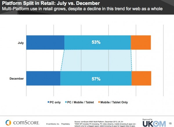
With technological advancements occurring at such a cracking pace, there is little difference (if any) between platforms for quality web usage. Statistically, web usage on PC only is on the decline, with users preferring to surf the web across a variety of platforms. In order to have a successful online presence in today’s web environment it is necessary for your website to be clearly viewed on PC, tablet and mobile.
There are two forms of web design – adaptive and responsive – that allow you to cater to multiple platforms for your users. Adaptive design requires separate sites to be developed at the resolution of each device, with user agents choosing the correct site for your device as the page loads. Responsive design is much more flexible – resizing itself depending on the resolution of the device viewing the site. It’s cheaper, as only one site design needs to be developed. Catering to the massive amount of mobile business being generated by having responsive sites is the only way for companies to stay afloat.
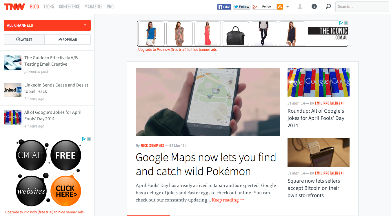
The Next Web is a great news/blog site that demonstrates responsive design
8. Fixed Navigation
Navigation is the most important user experience of a website. Clean, clear navigation allows users to move from page to page, and find the content they want to see. Fixed navigation, either top or side menu, allows users more freedom to explore a website without scrolling endlessly to return to the top.
Our Mammoth website also has a simple, clean fixed navigation bar.
7. Typography
Beautifully crafted, iconic typography is almost a necessity to have on your website now, and with the invention of TypeKit and Google WebFonts this is now easier than ever. There is such a broad range of fonts available, it’d worth investigating ways to make your website more “custom” and recognisable. There are some brilliant examples of sites out there utilising this opportunity to express themselves typographically, such as RSQ, Flandria, and Knuckles Industries.
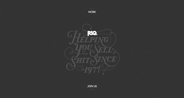
RSQ have a lovely, clean minimalistic site showcasing their tagline with quirky style.
Typography is bigger and more creative than ever. Sites that use Arial as a default are no longer necessary, as there are more creative ways to express your personal or professional personality that are compatible with most web browsers.
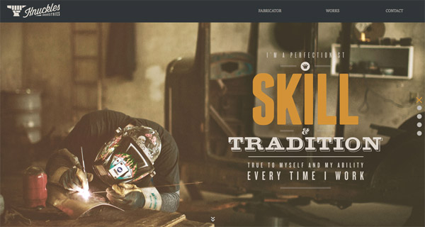
Knuckles Industries is the home of a metal-lover and fabricator, whose honest, self-made skills are demonstrated through the use of a mix of traditional serifs and modern sans serifs.
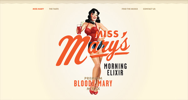
Miss Marys parallax scrolling, bold, vintage-styled site that will make your eyes pop
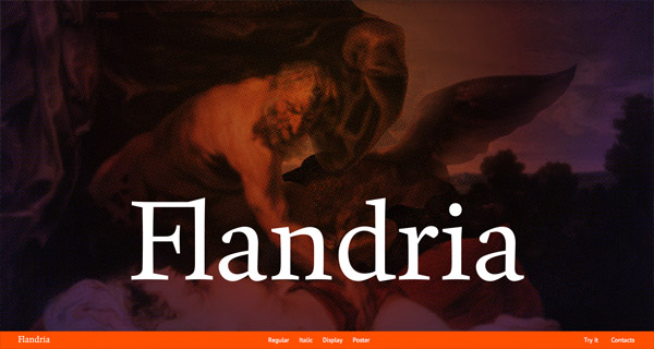
Flandria, a website devoted specifically to showcasing this new font, uses typography in interesting ways to show the font’s range and varying weights.
6. Parallax Scrolling
There is a bit of a divide in regards to this design trend as to whether it is confusing, overrated and unnecessary, or bold, creative and a new way at utilising online space. For those who aren't familiar with this trend, the term “parallax” first came from the visual effect of 2D side scrolling video-games that used different background image movement speeds to create the illusion of depth during game-play. Parallax scrolling usually uses a single, long page in which the background of the website moves at a different speed as the rest of the page for an impressive visual effect that allows for countless creative applications for online storytelling. There are some downsides to parallax scrolling, such as a detrimental affect on SEO - as the site is only one page so only allows for one set of meta information, high image quantity will increase load times, and not compatible with responsive or mobile design (not well anyway).
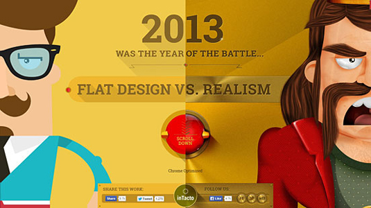
Flat Design vs Realism is a humourous comparison of the visual differences between flat and skueomorphic design told using amazing imagery and, of course, scrolling.
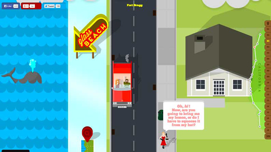
Highway One, a microsite created by Shout Digital, is a retro, cartoonistic journey through the sights and experiences of California’s highway one.
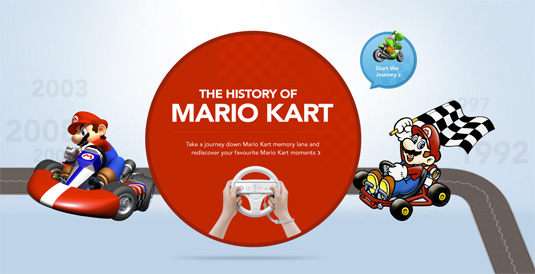
The History of Mario Kart, designed by Nintendo, has the user scrolling through twists and turns of a “track”, introducing them to the history of Mario Kart as they launched the Wii version.
5. Video / Animated Backgrounds
Video is still one of the most powerful tools of communication, and the ability to have a short video as your website background is a whole new level of design, and developing personality. Video is such an effective story-telling tool as much can be said without words. It’s emotive, modern and decidedly cool. It does increase page load time, so as with all things, it is designed with a purpose in mind rather than a gimmick.
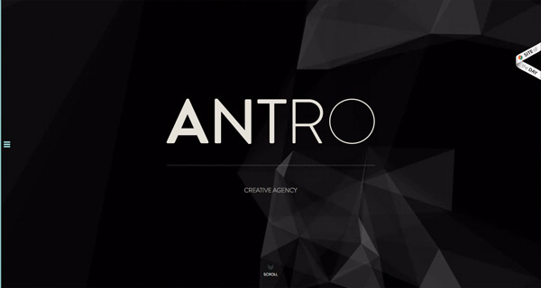
Antro are a creative agency with a minimalistic, typography heavy site design. Check out the video behind their opening screen – very cool!
When was the last time you did something for the first time? Full-blown video site with a warm and fuzzy message.
4. Richer Content Experiences
As some of the examples included earlier demonstrate, some of the current web trends, such as parallax scrolling or video backgrounds have opened the web up to developing compelling user experiences. Websites are no longer just for displaying information, but can be for immersing the user in a story that enthrals and entertains, for a purpose. Flat Design vs Realism, Highway One, the History of Mario Kart are some of the sites already mentioned that utilise these trends to the best of their storytelling ability. They have crafted an interactive user experience.
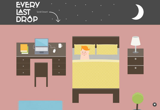
Every Last Drop is a retro, cartoon, informative journey through water consumption and conservation.
Peugeot has developed a graphic novel-eque site for its Peugeot4 Hybrid. The level of detail is just stunning!
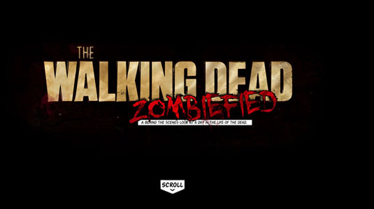
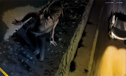
For all the Walking Dead fans out there – this site is a comic-book styled joy to scroll through.
3. Infographics
Infographics are still one of the best ways to present information in print, or online. The ability to showcase data in a readable, relatable manner for the target demographic means that information is much more easily digested and remembered. What is an infographic? Basically they are images that utilise stylised typography and graphics with bold colour schemes to display information in a memorable way. As with all forms of design, infographics are used to tell a story. Whether that story relates to the facts about water consumption, 10 things not to do on a first date, or statistics regarding the growth of wheat in Queensland, they are designed to be quirky and interesting to the reader.
While visiting the Mammoth Blog site, you’ll notice we have some of our own infographics (which we've labeled “factoids”) that give you a little insight into the people behind the giant “M”. We hope you enjoy these, and learn more about life at Mammoth.
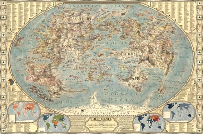
Martin Vargic’s Map of the Internet 2.0 is a vintage-style map of the content of the web, with major websites and companies from different industries grouped together as “continents”.
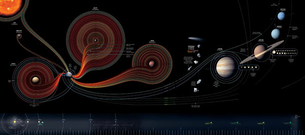
National Geographic showcased this incredible infographic, designed by Sean McNaughton and Samuel Velasco, to depict the last 50 years of Space Exploration
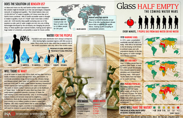
Princeton University created this infographic, entitled “Glass Half Empty: The Coming Water Wars” to express the need to conserve water now.
2. Larger Hero Areas
Effective web design often makes use of “above the fold” areas to catch and keep users interested in the content of their site. In the past this area has often been filled with carousels that cycle through content to display various features of the company, or website itself. According to Erik Runyon, Director of Web Communications and a web developer with Marketing Communications at the University of Notre Dame, who did a study of various University of Notre Dame websites (as an example) that use carousels, it was found that only 1% of users clicked a carousel to get more information regarding a feature. Out of all positions on the slider, the image located first had the highest amount of clicks at 89.1%, with all of the following four positions ranging between 2.4% and 3.1%. While this data in not necessarily indicative for the rest of the web, it does highlight some of the failings of carousels.
Is this trend still popular in 2014? Not as much. The area “above the fold” on websites is now populated with large “hero” areas. These areas usually contain a large image with a small amount of text. These images range from a simple blurred photo, to a much more elaborate, stylised cartoon. In any case, these “hero” areas are becoming more and more popular on new websites in 2014.
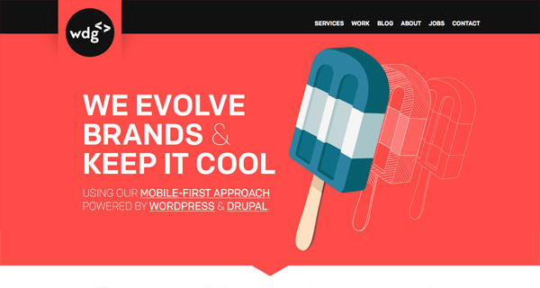
WDG, The Web Development Group, have a quirky, modern vector image to get their message across.
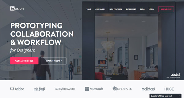
Invision are a perfect example of how a “hero” area can capture users attention without needing to include a carousel.
1. Grid/Card Layout
Grid-layout, or cards, is fast becoming the best design pattern for mobile devices. Considering how websites are being geared more and more towards mobile-first design, this is not a trend to miss. We are currently seeing a reconfiguration of the web away from pages and destinations, towards personalised experiences built on the aggregation of individual pieces of content. The web is accessed from a variety of screen sizes now, and information re-aggregated to suit the shape and resolution of specific technologies is the way of the future.
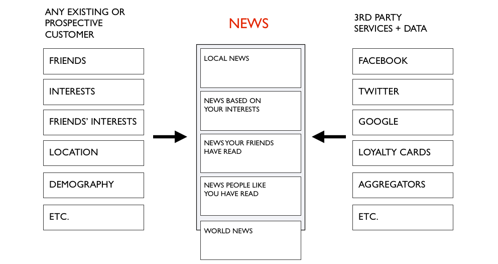
This information aggregation depends on a variety of factors:
- the individual consuming the content, their personal likes, behaviours, etc
- their location and environmental context
- their friends interests, behaviours, etc
Sites such as Twitter, Google, Facebook, Amazon and Pinterest are all beginning to change their layout to reflect this new trend (though Pinterest was build around card design).
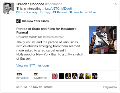
Twitter has just introduced “Cards” that allow you to attach Media experiences to your content.
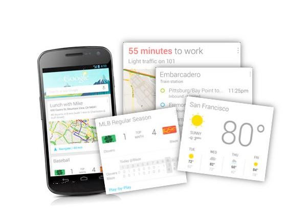
With Google Now, Google is rethinking information distribution, away from search, to personalised information pushed to your device.
Usability, mobile-first design, high quality video and image usage, and creative typography are just a few of the areas in focus this year’s design trends. It is becoming increasingly important to understand the user experience to craft more intuitive, content-focused websites with cleaner functionality. Here at Mammoth are looking forward to seeing more examples of these trends as 2014 continues and we would like to hear from you - Which web designs do you like best in 2014?


